
Attachment
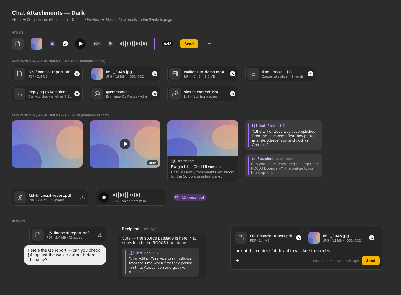
A compact attachment chip with a hover preview, or expanded content for documents, images, media, corpus text selections, quoted replies, @-handles and URL cards.
Preview
Use the controls to explore the component's props.
The default variant opens a preview on hover or keyboard focus for every attachment type. Use it in the composer and in sent messages; sent chips omit the remove button. The preview variant displays expanded content directly, without another hover preview. Both use the shared rounded-lg radius.
Pass the original file to let the component detect its type and create a local preview. Images display their content; videos show a frame and playback controls; audio has a player; text documents show an excerpt. PDFs use the browser's document viewer in the hover card. Unsupported formats show their file information. No file is uploaded automatically.
For uploaded files, supply src. You can also supply a thumbnail, previewText, or custom preview for a document or link whose content needs a server-generated preview. Object URLs are released when the attachment unmounts or its file changes.
Props
| Prop | Type | Default | Description |
|---|---|---|---|
kind (required) | "document" | "image" | "media" | "text-selection" | "chat-reply" | "username-handle" | "url-link" | — | Which attachment; picks the leading icon and the preview layout. |
variant | "default" | "preview" | "default" | Compact chip with hover/focus preview, or expanded content without a hover preview. |
title / meta | ReactNode | — | Primary and secondary chip lines. |
onRemove / removable | () => void / boolean | — | The chip's ✕. Hidden when no handler is passed or removable is false. |
file / src | File / string | — | Original local file or uploaded content URL. Local files are classified automatically. |
thumbnail / previewText / preview | string / string / ReactNode | — | Supplied thumbnail, document excerpt, or custom hover content. |
mimeType | string | File MIME type | Content type for a URL, e.g. application/pdf for a document preview. |
kind props | src, poster, duration, audio, onPlay, quote, author, time, body, initials, domain, description, favicon, href, onAction | — | Accepted per kind; the union type rejects props that don't belong to the chosen kind. |
Example
Iliad · Book 1

Annotation notes
¶12 — Compare the paragraph boundary with the source edition.
¶17 — Check the speaker attribution and lemma links.
import { Attachment, Bubble } from "@exegia/corpora-ui"

<Attachment kind="document" title="Iliad annotations.pdf" meta="PDF · 2.4 MB" onRemove={remove} />
<Attachment kind="url-link" variant="preview" title="Exegia UI" domain="sketch.com" description="…" href="https://sketch.com" />

// Preserve file and kind-specific props when moving a tray item into the thread.
<Bubble variant="sender">
  <Bubble.Message unstyled>
    <Attachment {...attachment} variant="default" removable={false} />
  </Bubble.Message>
</Bubble>
Last updated on
Emoji action bar
Compact reaction picker: a toolbar of quick reaction emoji built on the action-bar composed component, with a trailing More action that swaps the surface for the full frimousse picker. Designed to sit inside a glass popover.
Chart
Pie, area, line and bar charts for corpus research, with a passage or Strong’s reference pill, plot and legend. Series colours come from the --chart-series-1…5 tokens, grid from --chart-grid.